About Blick Entertainment
Built from the brush stroke and the ring
Blick Entertainment began with two marks: a purple brush-stroke wordmark and a black-and-purple curved ring. This page explains where they come from and how they carry onto everyday clothing and accessories.
The identity
A wordmark and a ring that travel together
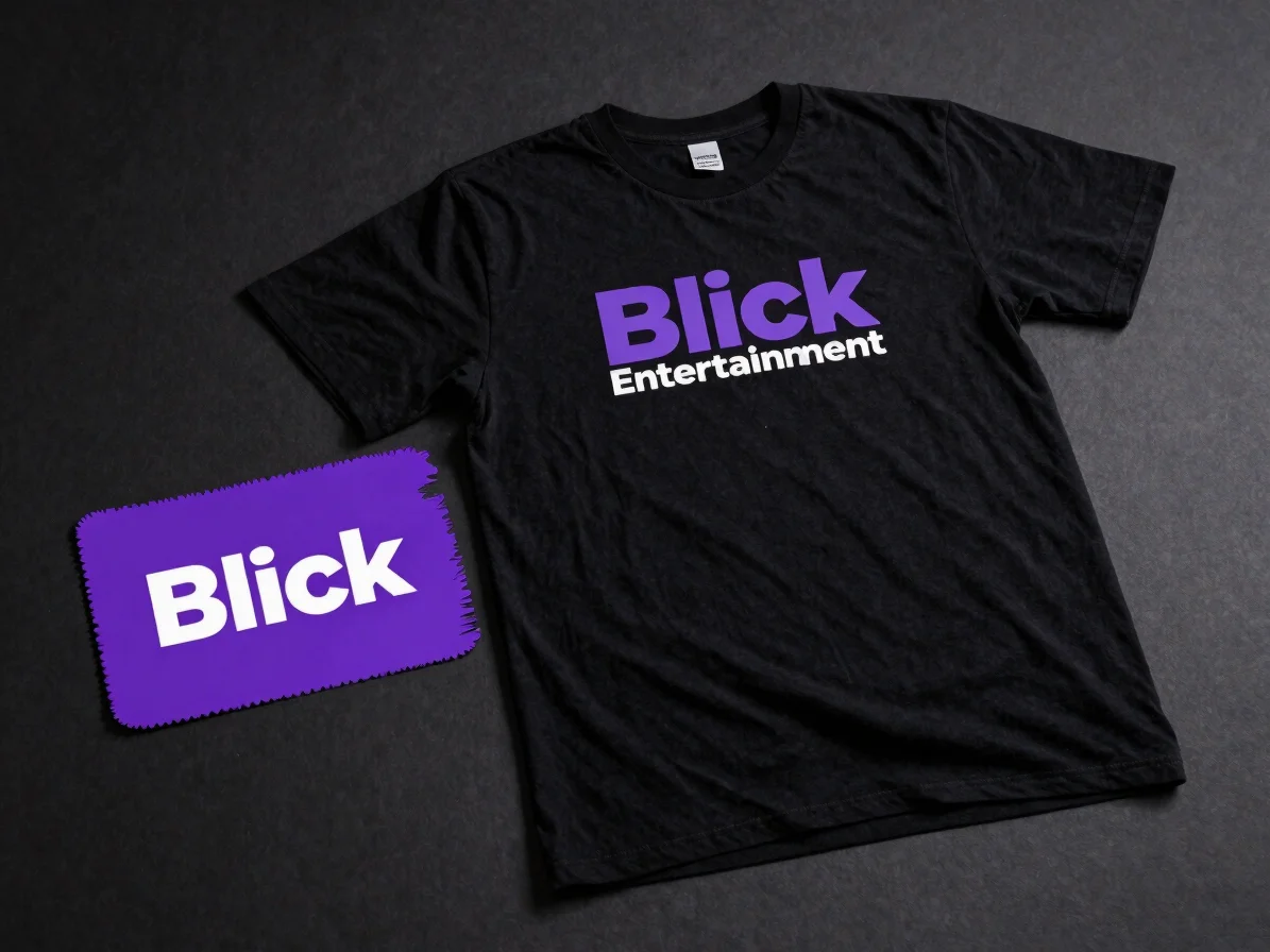
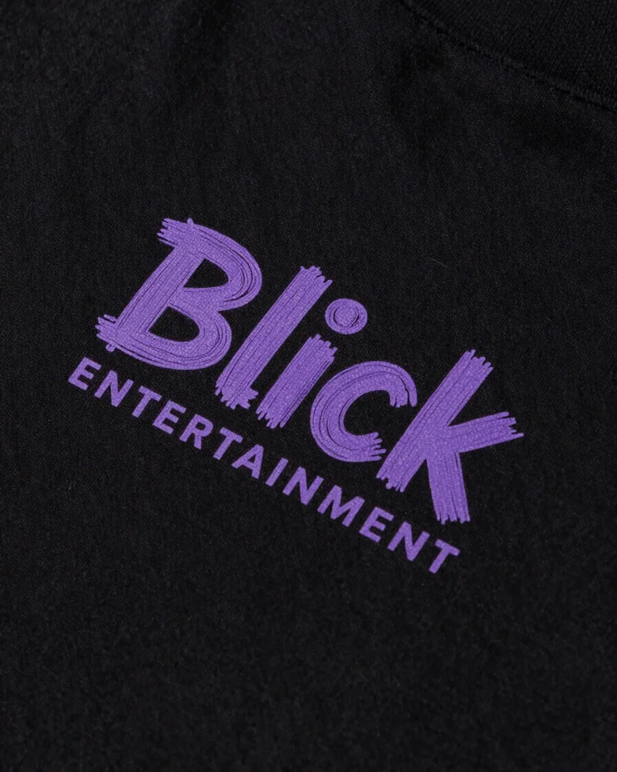
The Blick Entertainment logo pairs bold purple brush-stroke lettering with a black-and-purple curved ring. Each mark is designed to read clearly on fabric, so the same identity appears on a T-shirt, a hoodie, or a cap without changing shape.
The range is built around everyday casual wear for shoppers who want a recognizable brand thread across pieces they already wear. Custom T-shirts, hoodies, vests, and shirts sit alongside embroidered caps and keyholders.
Craftsmanship
Print, embroidery, and hardware, each handled with care
Print finish
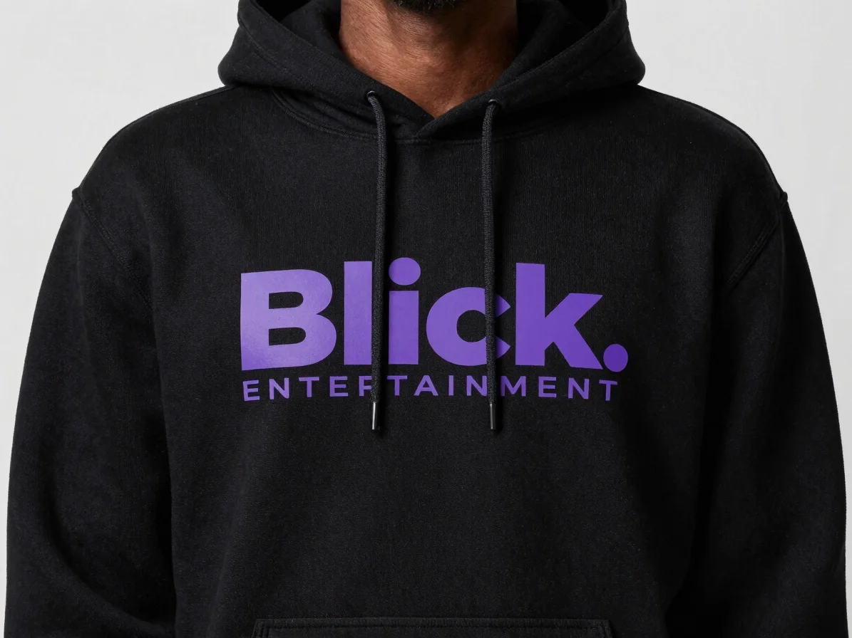
Clean logo placement
Blick Entertainment logos are placed with consistent alignment across tees, hoodies, vests, and shirts so the mark reads the same on every piece.
Embroidery
The curved ring on caps
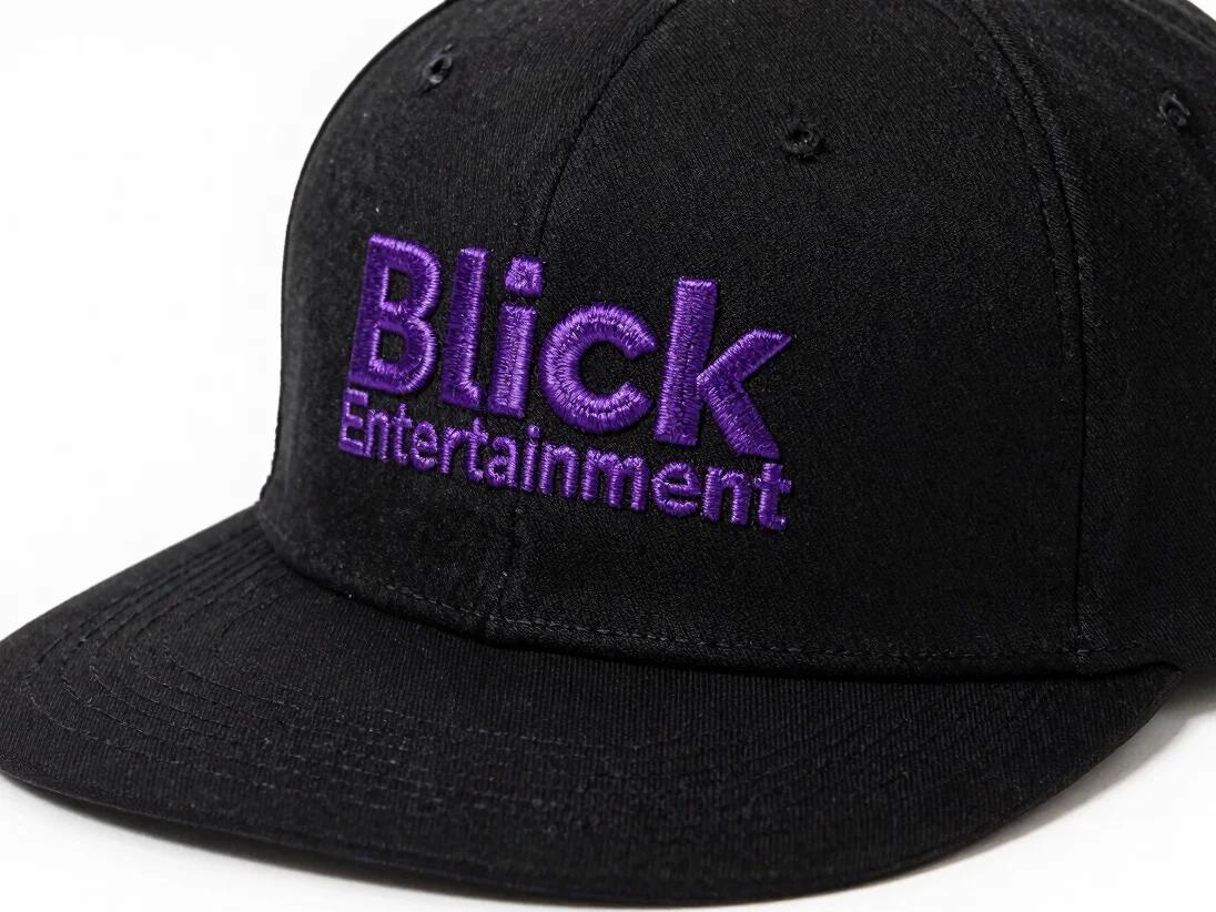
Embroidered caps carry the clean logo motif, so the ring and wordmark appear in a stitched finish suited to everyday wear.
Hardware
Durable keyholders
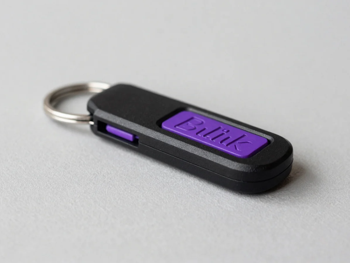
Custom keyholders are styled with the brand aesthetic, bringing the same purple and black identity to a small everyday accessory.
Our mission
Make the Blick Entertainment identity wearable every day
Blick Entertainment exists to turn urban streetwear energy into everyday casual staples, with each release built around the same brush-stroke typography and curved ring emblem.